The colors are crucial in determining the mood and ambiance of a house. They have a huge impact on feelings, energy, comfort and productivity. understanding color psychology in design is a valuable tool for any home interior design project.. The right hues can enhance a home’s peacefulness, vibrancy, coziness, or luxury, depending on their application.
Some homeowners opt for certain colors simply because they are in fashion or just what they like, but smart color choices can enhance their lives. Each room has a specific function, and the colors to be used in each room should be in harmony with the function. The use of color psychology in design can help to create spaces that are not just aesthetically pleasing, but also emotionally engaging.
What is the psychology behind color?
Color psychology in design is the study of the and the impact of colors on human emotions and behavior. Warm colors (red, orange, yellow) bring excitement, warmth and energy. Cool colors such as blue, green and purple are relaxing and soothing.
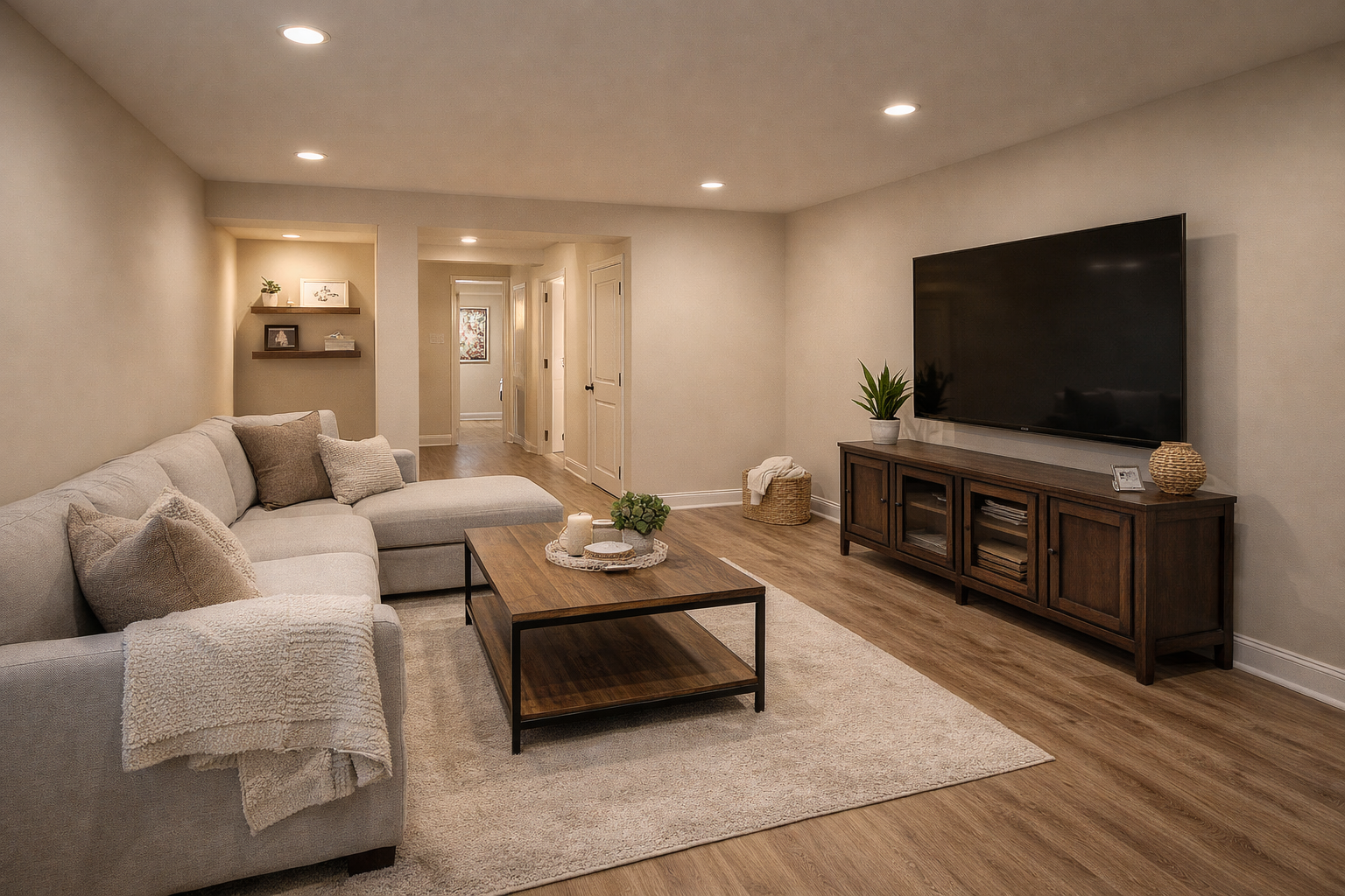
Using neutral home interior design colors like white and gray adds balance to your home. These hues are commonly used in creating classic interior designs which are clean and organized.
Homeowners can use this knowledge of emotional responses to select colors for each room and how they will be used.
Using Blue for Calm and Relaxation
Blue is a popular color used in design due to its soothing nature, making it one of the most used colors in color psychology in design. Many people use it in their bedrooms and bathrooms where relaxation is key.
Light blue colors bring a new and serene look about them, whereas darker blue hues are elegant and sophisticated. In the home offices, blue is also suitable, as it promotes concentration and focus.
A combination of blue and white furniture or natural materials establishes a harmonious and contemporary setting, making it a comfortable and inviting interior.
Bringing Freshness With Green
Green represents nature, health and balance. Green in the field of design is commonly employed to create a refreshing and harmonious ambiance.
Living rooms and kitchens are best suited for soft green tones as they are not overpowering but still make a comfortable space. For a dining room or office, dark green shades can be used to create richness and luxury.
Include indoor plants with green walls or decorative items to add to the natural and calming atmosphere in a room.
Creating Warmth through Yellow
Yellow stands for positivity, happiness and warmth. It is also extensively employed in design as a technique of color psychology to enliven interior spaces and give them a sense of cheerfulness.
They tend to be good colors for kitchens, breakfast spaces and entryways as they make them welcoming and agreeable. Children’s rooms or work areas might also have a creative and energetic environment with bright accents.
Strong yellow can be overwhelming though, and should be used sparingly, such as in pillows, artwork, or accent walls.
Add energy with Red
Red is a strong colour which represents passion, excitement and energy. Red is a colour that is used to create dramatic and lively spaces in colour psychology in design.
It is particularly effective in living rooms, dining rooms and rooms for entertainment where it promotes conversation and social interaction. Red can also create warmth in spaces that are larger than usual and may feel empty or chilly.
Red can be very stimulating, and should be used carefully with neutral colors to make sure a room is not too intense.
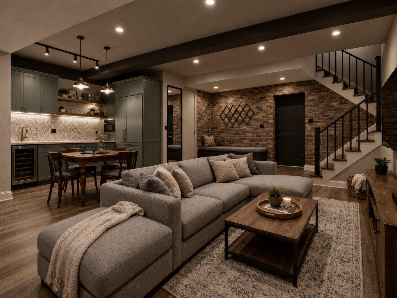
The Importance of Neutral Colors
The use of neutral colors in color psychology in design is key due to their ability to provide balance and flexibility. Banks that use white, gray, beige and taupe are always in style and will coordinate with many interior styles.
White brings a sense of spaciousness and lightness to rooms, whereas gray exudes a sense of refinement and modernity. A neutral beige and soft brown provides warmth and comfort.
Neutral backgrounds are also helpful for adding some colors to a room in order to avoid the room from looking cluttered.
Color Matching for Room Functions
Finding the right interior paint color ideas and matching them to room functions is essential.
Bedrooms should be a neutral color or gray to promote rest and relaxation. Warm and cozy colors create a comfortable atmosphere in the living room, which fosters a sense of togetherness and sociality.
Drab colors like blue or green are best for home offices because they will help you concentrate better. Yellow or white accent colors can add a lively and cheerful touch to kitchens.
Using colors based on the space used enhances the atmosphere and usability of the house.
How to use accent colors effectively?
It doesn’t always mean that homeowners have to repaint the whole room to enjoy the benefits of the color psychology in the design. Even smaller decorative details can be accented to form powerful emotional impacts.
A room’s atmosphere can be dramatically altered by colorful cushions, rugs, curtains, artwork and decorative accessories. This can also give the homeowner an easier way to change the interior of their home over time.
For instance, if you are decorating a neutral room with blues, you can make it more soothing, and if you decorate it with yellow, it would look more lively and energetic.
Key Factors of Lightening
Proper lighting has a profound impact on how color psychology in design works in a room. One of the key elements of applying color psychology to design is the understanding of the connection between color and light.
Natural light will help colors look more vivid and bright, and artificial light will alter color tones based on the type of bulb that is used. Warm lighting creates a cozy ambiance, and cooler lighting quantities spaces a fresh and contemporary look.
Homeowners can avoid surprising outcomes when they paint by testing colors under various lights.
Final Thoughts
Color psychology is crucial in design, enabling homeowners to craft emotionally uplifting and stylish interiors. Colors have an impact on mood, comfort and experience in a living space.
The thoughtful use of calming blues, refreshing greens, energetic yellows and neutral balancing colors can help homeowners create welcoming and functional rooms from ordinary ones.
Whether through paint, furniture, or decorative accessories, thoughtful color choices help create a home that reflects personality while improving everyday comfort. Applying the principles of color psychology in design is a simple but effective way to create interiors that look beautiful and feel emotionally balanced.
FAQs
1. What is the meaning of color in design?
Color psychology is the science behind the impact of color on mood, emotional and behavioral response in interior spaces and designs.
2. Which colours are relaxing?
The interiors are typically calm, with gentle neutrals with blue and green touches.
3. Does color have a larger scale dimension?
Lighter colours will give a greater impression of space and light in a room.
4. Is yellow a good colour for inside?
Indeed, when used properly, yellow can be a sign of warmth, happiness, excitement.
5. What happens to the colour when light shines on it?
Illumination also has an impact on colour perception. Some colors could be warmer or cooler depending on the light.
6. What colors do you think would be good to use for a home office?
Blues and greens to be toned down to draw attention and to focus.
7. Can accent colors fit into the home?
In fact, accent colors may add individuality and emotional punch to a room without overpowering the room.